SUMMARY
The most effective formats for content marketing and Digital PR do change over time. When I first started out in the industry, calculators and infographics were an effective way to gain coverage and build links. Actually, when I first started buying links was the most effective way to build links (It was a while back).
Over the past couple of years it’s been dream jobs, maps and data campaigns that have been doing a lot of the heavy lifting.
For me, the success of the campaign always comes down to the idea, then matching the best format to that idea.
We’ve looked into the success and trends of campaign types over the past 5 years, using analysis from Buzzsumo.com
Most published (average monthly articles past 12 months)
- Infographic: 6,577 articles*
- Survey: 2,105 articles
- Reimagined: 1,206 articles
- Study: 609 articles
- Data: 515 articles
- Maps: 435 articles
- Index: 153 articles
- Dream jobs: 34 articles
*Number skewed slightly by a couple of domains that constantly publish their own infographics.
Biggest movers year on year
- Index campaigns: +40% Year on year
- Data campaigns: +26% Year on year
- Infographic: +23% Year on year
- Survey: +7.5% Year on year
- Study campaigns: +3% Year on year
- Dream jobs: +1.2% Year on year
- Reimagined campaigns: -10% Year on year
- Map campaigns: -18% Year on year
NOW GET PAID TO AKA THE DREAM JOB
Articles published the past year – 415
Articles published the previous year – 410
‘You can now get paid to’ – the headline that the majority of the public read and think ‘Awesome, I can get paid to do something I already do for free’ and the PR world sees and thinks ‘PR campaign, who’s behind this one?’.
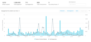
Dream job campaigns have ebbed and flowed over the past 5 years. The last few months has seen an increase and there has regularly been over 30 articles published per month.
Out of the 1,813 articles analysed in the past 5 years, there were over 1.2m social engagements with an average of 3 linking domains per article.
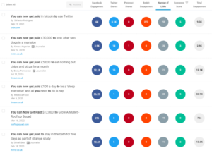
In terms of the most linked campaigns.
- You can now get paid in bitcoin to use Twitter
- You can now get paid £30,000 to look after dogs in a mansion
- You can now get paid £5k to eat chips and pizza for a month
The mullet one is my favourite, getting paid $12k to grow a mullet is more of an inventive angle than most. It seems the sillier they are the more likely they are to get pickup – which is kind of how this format works.
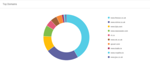
The top domains include The Sun, Mirror and Tyla. So there are a mixture of nationals and industry style press that are interested in covering these kinds of campaigns
My gripe with it – if you sell biscuits, coming up with an idea where you pay people to test biscuits seems like the first idea in a brainstorm. If we churn and burn these campaigns as the industry grows we will run out of dream jobs to pay people for.
INDEX SHOWS
Articles published the past year – 1,844
Articles published previous year – 1,309
YoY increase – +40%
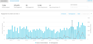
Indexes are a great way to pull together a comprehensive piece of content that has multiple angles for outreach. ‘Index shows articles are up 40% year on year which means they are probably a safe bet when it comes to a format that will consistently be published, Of course, this still comes down to the idea and the angles within that idea.
This type of format tends to work best for more serious topics or less light hearted sectors. It allows you to pull together unique data and rank the data in a specific order, so you can see why this would work best for economic or finance related content in particular. Other sectors we have seen it work well in are the likes of US sport where you can rank fans, teams and players.
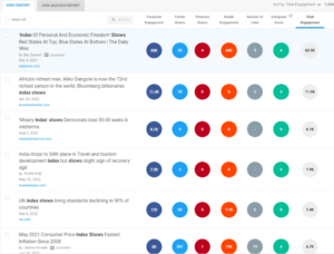
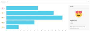
There’s a mixed range of emotions when it comes to indexes. You can easily rile a fanbase or sector with the rank of the index, likewise you can appease a location or party too if they are top of a specific index.
The domains that dominate this type of content are usually US nationals and finance type press. The multi regional angles you can pull together for indexes means they do lend themselves perfectly to US campaigns
NEW STUDY SHOWS
Articles published the past year – 7,314
Articles published previous year – 7,103
Year on year change – 3%
New study campaigns have been on the decline vs 5 years ago but they still regularly have over 500 articles per month published around them. Obviously this is fairly similar to ‘new data shows’ but it’s interesting to see the differences between the two. Data is definitely a word that is used more often to describe these campaigns. It perhaps sounds a bit more solid than the word study and you can see further down this article new data shows articles are up 26% year on year.
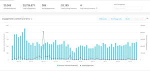
The most socially shared content around this type of content can still be fun, actually the most socially shared content has been family orientated. Studies that have a human angle to them seem to do very well socially.

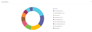
You would think study type campaigns would only appeal to serious topics and more serious types of publications. However, the evidence shows that The Daily Mail and The Independent pick up a lot of the social engagement around these topics.
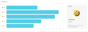
Studies achieve a wide range of emotional reactions on social. Again, you’d be forgiven for thinking the word study is associated with serious campaigns but it’s actually the more light hearted type of campaigns that do well and drive a lot of laughter and love emotions.
NEW DATA
Articles published the past year – 6,180
Articles published previous year – 4,887
YoY Increase – 26%
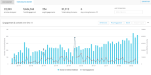
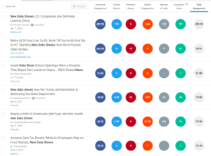
New data articles are on the rise, up 26% year on year and published in high volumes per month. Data is becoming more and more important in PR and it’s easy to see why. We excluded Covid related new data articles in order to try and get a fair reflection vs other types of campaigns.
The most socially shared content and linked to content around new data is heavily finance related and does lend itself to more serious niches like finance, law, economics, politics etc
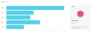
New data makes people angry. We live in a time where people get their opinions confused with facts, so it looks like new data can really rile people if it’s something they disagree with. There is a nice mix of other emotions there to run with too but the stand out is definitely anger. Something to consider when pulling these types of campaigns together.
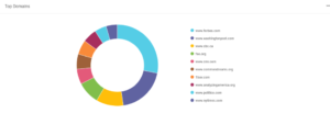
Data campaigns are a great way of getting onto some big US sites. The likes of Forbes, Washington Post and NY Times all dominate the social engagements for data campaigns.
REIMAGINED
Articles published past year – 14,482
Articles published previous year – 16,110
Percentage change – -10%
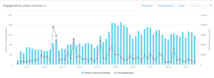
Reimagined campaigns are some of my favourites. Showing the difference between two opposing things or reimagining something as a completely different concept is an area I feel is only going to expand with the introduction of AI into the content creation process. Reimagined campaigns are down year on year 10% however. If you look at the five year curve they are definitely up over the past 2 years vs previous periods, with over 800 articles regularly published per month. The pandemic definitely caused a spike in the format, there were a lot of ‘cities before and after lockdown’ type content that was being published at the time which inspired other similar types of campaigns.
The format of content is a lot more inventive. The most socially shared campaigns include:
- Disney princesses reimagined as modern day millennials
- Steve Irwin reimagined as a Pokemon trainer
- Artists reimagine countries as anime characters
The beauty of a reimagined campaign is you can take something that is trending and reverse it or splice it with something else. It takes a certain type of client in order for it to work best, something where there is a passionate fan base or something that has a lifestyle angle usually works best.
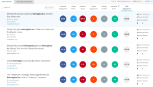
The most linked to campaigns (well done Neomam) include:
- Fictional homes reimagined as Polly Pockets
- SUVs reimagined as sedans
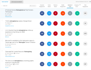
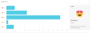
The emotions that these types of campaigns elicit are mostly love – that’s why they are perfect to tie into an industry or area that has a large fan base, or creating a crossover between 2 large, vocal fanbases. Think Pokemon mixed with Nike Air Max.
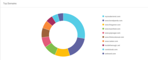
If you are looking to get into gaming or lifestyle press then this is the campaign format to do it. Bored Panda, The Gamer, Buzzfeed and Comicbook.com own the majority of social shares around reimagined articles.
INFOGRAPHIC
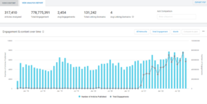
Past year – 78,932
Previous year – 64,257
Increase YoY – 23%
This is an interesting one, a huge amount of articles are still published about infographics still. They used to dominate the link building landscape and now it looks like they are still published to visualise data by a number of big sites.
Articles published around infographics are also up 23% year on year. Are they on the rise again in the press or is this just a handful of sites that still use the medium when publishing content?
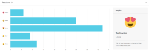
Infographics tend to elicit mostly positive emotional reactions on social. With the majority of reactions leaning towards love or laughter. They don’t make many people sad, apart from me when I had to churn out four a month…
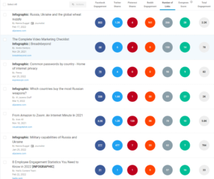
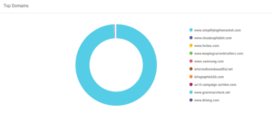
A look into the most linked to content and the types of domains that get the most social shares does show that the likes of Visual Capitalist and simplifying the market dominate this kind of format because it is their go to format for their own content creation. A mixture of these types of sites and using infographics to visualise political or complicated events seems to be the most common use of the format.
NEW SURVEY
Articles published past year – 25,264
Previous year – 23,501
Percentage increase – 7.5%
Everyone loves a survey don’t they? No? Okay some people love a survey. They can be an additional expense on top of the campaign but they can also provide unique data, which journalists love. New survey campaigns are up 7.5% year on year.
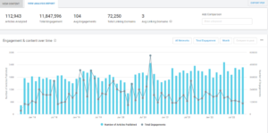
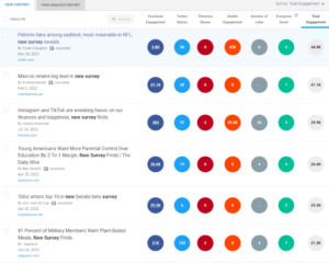
Surveys can lend themselves to a variety of niches. Some of the most socially shared content includes:
- Patriots fans amongst the saddest in the NFL
- Instagram and TikTok are wreaking havoc on our finances
- 81% of the military want plant based diets
There’s scope to do surveys across a range of sectors. There are a lot of third party providers that can help gather responses but you can also use Google forms and paid social ads targeting people who you know are relevant to the campaign. For example, if you want survey results from Marvel fans you can target Marvel fans on FB and Instagram with the survey with an incentive for filling out. This can be cost effective in the right niche.
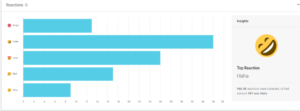
Surveys bring out a range of emotions but the majority of responses are perhaps surprisingly positive with laughter and love dominating.
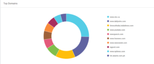
The American publications love a survey, especially the likes of CBC, Fox News and NY Post.
MAP SHOWS
Articles past year – 5,226
Previous year – 6,411
Percentage change – -18%
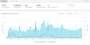
Maps are dead. I’m joking but map articles are down 18% year on year. They were at their highest point 2 years ago now and have been on the decline since. I put this down to oversaturation, more and more map campaigns are being produced which means journalists are being overwhelmed with them, we will also eventually run out of ways to use maps to visualise campaigns (eventually, there are of course lots of different types of maps we could be using).
There are still over 400 articles published per month around maps – showing why they are still a go-to campaign type for PRs.
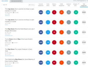
Some of the most socially shared map campaigns over the past 5 years have been the more inventive ones:
- US Canada border
- What the world would look like if Pangea still existed
- Largest employer in every state
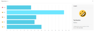
Maps have a wide range of emotions too. Laughter is the main one but you can twist a map to appeal or not appeal to different industries or areas, especially in the US. So there is a wide range of emotions you can tap into with the format.
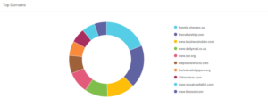
Map campaigns are perfect if you want to be targeting The Daily Mail, regional US or UK publications, Culture Trip and Timeout.
OVERALL COMPARISON
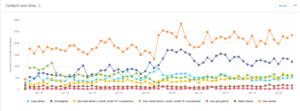
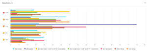
Below you can see a side by side analysis (minus infographics that skewed the data slightly) of all types and how they compare in terms of emotional reactions, content published over the past 5 years and average linking domains.
Emotional reactions by content type
Overall articles published by format

Overall five year comparison including average linking domains
