Typically if you hear the word index you will think of the financial instrument that is used to track the performance of equities or assets. They group a whole host of baskets or securities to give a measure of performance for a specific market or asset class.
But for us in digital PR, the index is an age-old classic PR format. They give us the ability to take a whole host of data points and create a ranking system of performance for your chosen index format. If you’ve ever seen a “best city for x” campaign – that’s an index. Some can be a bit more generic, but some can use unique data points and be quite creative. They are usually your first point of call in a brainstorm. Don’t worry, we’ve all been there.
But in a fight against bland campaigns and pushing ideas beyond the usual narrative, we thought we’d comprise the most unique and creative indices out there. Some of these were created for PR, and some are just Reddit and X users with an overactive imagination (if you are one of them we’re hiring). Either way, they might push your thinking the next time you are in a brainstorm. These show that you don’t need to limit yourselves when doing an index and you can still carry one out without losing your mantle of creative PR agency.
The Washington Pizza Index
The Washington Pizza Index was coined in 1998. A Domino’s branch by the White House found out that whenever there was a spike in sales at that particular branch, there would be something going down in the White House.
Basically, when sh*t went down, the pizzas were ordered it. Almost an early warning sign to the news.
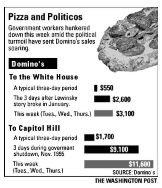
There is currently a lot going on in the world of politics, and I’m definitely not about to discuss that lovely topic here. But if anyone does the PR for Pret/Costa/Cafe Nero, it might be worth finding out if you’ve been busier than normal…
I’m dying for the Downing Street Tea Index to be born 🙏
The Big Mac Index
Next up is the Big Mac Index. Created by The Economist in 1986, the index is a clever tool that measures the purchasing power parity (PPP) between different countries. By comparing the price of a McDonald’s Big Mac in various nations, the index attempts to provide a snapshot of currency valuation against the US dollar. The process is straightforward: local Big Mac prices are collected, converted into US dollars, and then compared. If a Big Mac is cheaper in one country than in the US, it indicates that the local currency is undervalued. On the other hand, a more expensive Big Mac suggests an overvalued currency.
Finance is difficult to understand. But Big Macs aren’t. Changing this heavy dry topic into something fun and accessible gives way more of a press hook, even if it is just people finding it funny. Although it’s a simplified measure and doesn’t account for all economic factors), the Big Mac Index remains a popular and insightful way to grasp the fundamental concept of purchasing power parity and currency valuation.
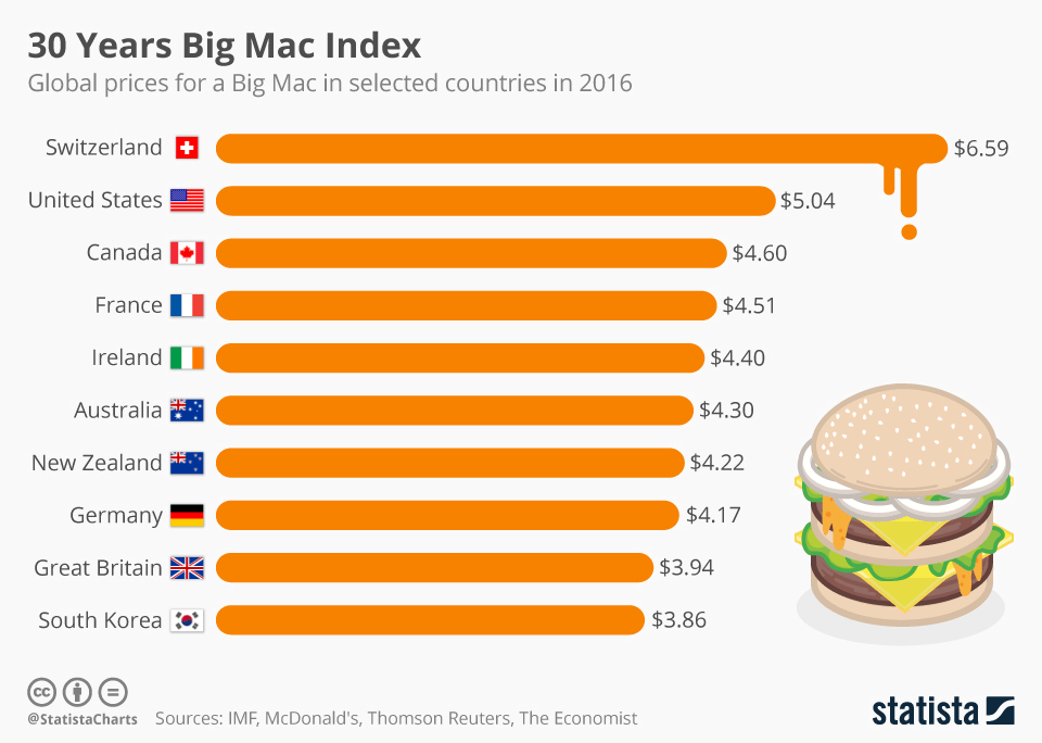
The lesson here is making something complex, and relatable. I’m sure you have all seen the jokes about the price of Lurpak. And if you are in a finance-related brand we have an idea ready to pitch already.
The Big Mac Index has inspired many others alike. Notably by Starbucks with their Tall Latte Index. I bet you are already thinking about how you can apply it to your brand already, aren’t you?
The Shoe-Thrower Index
Forget polls and pundits, the Shoe-Thrower Index is the real MVP in measuring political turbulence. This index captures the intensity of public discontent in a way charts and graphs never could – is there a milkshake-throwing one for the UK yet? If the shoes are flying, you know things are heating up.
Men’s Underwear Index
Who knew underwear could be so revealing? Well they are, and it’s told in the Men’s Underwear Index. Apparently, sales of men’s underwear are surprisingly stable—until a recession hits. When men start skimping on skivvies, you know the economy is feeling the pinch. I can neither confirm nor deny the truth in this.
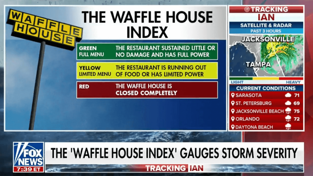
The Waffle House Index
So some prior knowledge is needed for this one. In America, Waffle House is open 24/7. They probably don’t even have locks on the doors. This campaign was actually executed by the government agency FEMA (Federal Emergency Management Agency), so next time you think an idea is risky, just remember even the US government can have some fun.
The quirky tool measures the severity of storms based on whether the nation’s diners are open, closed, or serving a limited menu. Green means all’s well, yellow is caution and red spells trouble. It’s comforting to know that in times of crisis, Americans can look to a favourite 24-hour eatery as a guide.
The Hipster Index
We’re getting deep in classic Digital PR territory here, but definitely a fun one. The Hipster Index by Move Hub the go-to guide for gauging just how cool a city is. From craft breweries to vinyl record shops, this index measures the density of all things artisanal. With over 3000 links it was definitely a success. If I was them I would be repeating this every year with updated figures.
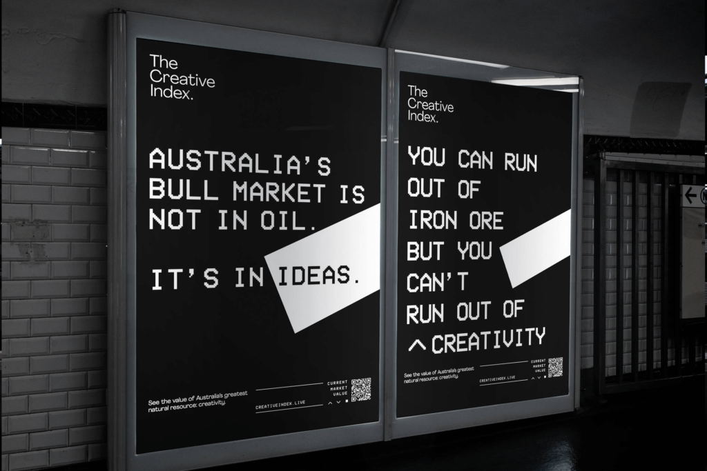
The Creativity Index
This one’s right up our street obviously. The Creative Index was launched by investment and advisory firm Jarden – tracking the economic value of creativity, Australia’s greatest natural resource. The campaign was centred around driving home the economic value creativity brings to the market. The index aggregated Australia’s top creative companies using historical and live data. The result showed the proof of performance and the power of creativity as a dollar figure. Who said you can’t put a price on creativity?
The takehomes
Index campaigns have always been and will continue to be a great way to earn media attention. However, they vary in levels of creativity and innovation. They can be executed within any niche and still capture the interest of your target audience. If a pair of dirty underwear can be related to the economic landscape or a Waffle House to natural disasters, then it’s certainly possible for your brand to innovate as well.